Mapping Gowanus
Brownfield Sites
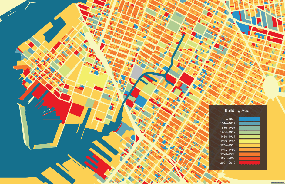
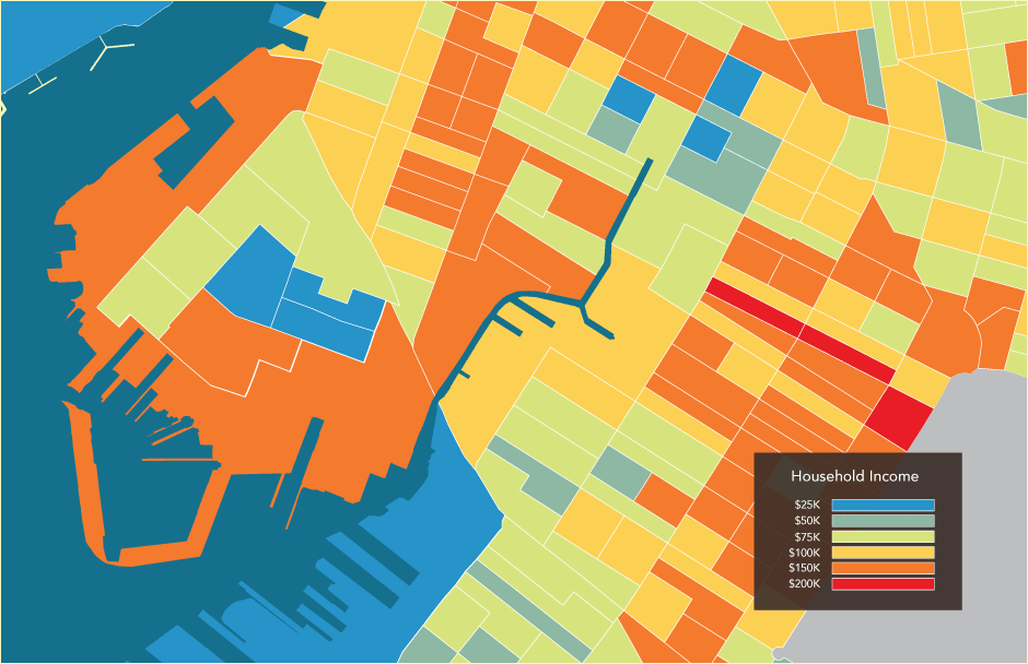
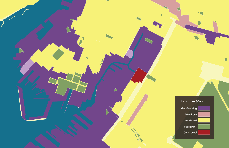
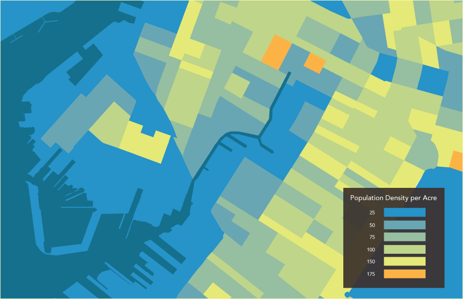
Building Survey
Historic Coastline
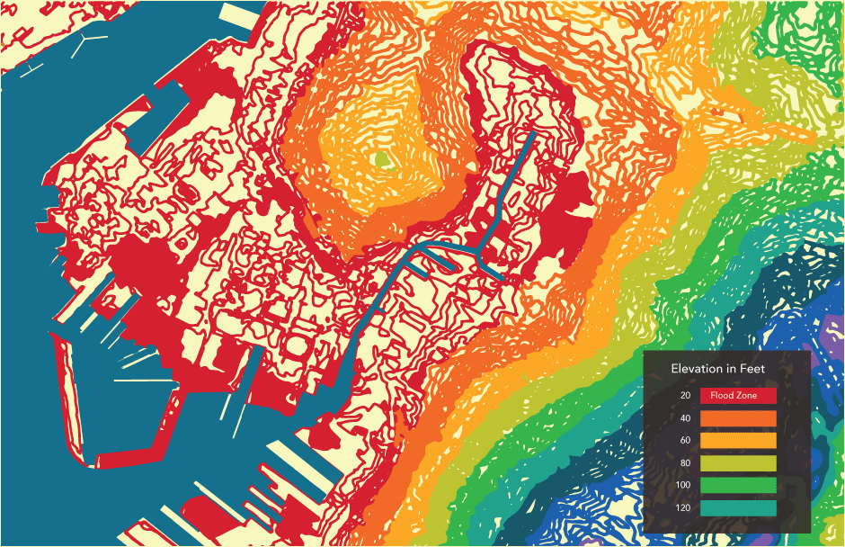
Elevation Map
Watershed Area
Superfund Timeline
ESRI ArcGIS Maps